PRODUCT DESIGN • UX RESEARCH
Nourish: Understanding the Gap
When Intention Doesn't Equal Action
How I architected research infrastructure to decode why 54% of diners never share, building the bridge between data and human truth.
ROLE
Design Technologist
TIMELINE
12 Weeks
TEAM
3 Members
YEAR
Fall 2025
The Brief That Changed Everything
In September 2025, Scale Social approached our team with what seemed like a straightforward question: "Who are our ideal users?" They assumed frequent diners would naturally become frequent posters.
That wasn't the case.
As the Design Technologist on a three-person team, I didn't just help answer their question—I built the technical infrastructure that revealed they were asking the wrong question entirely.
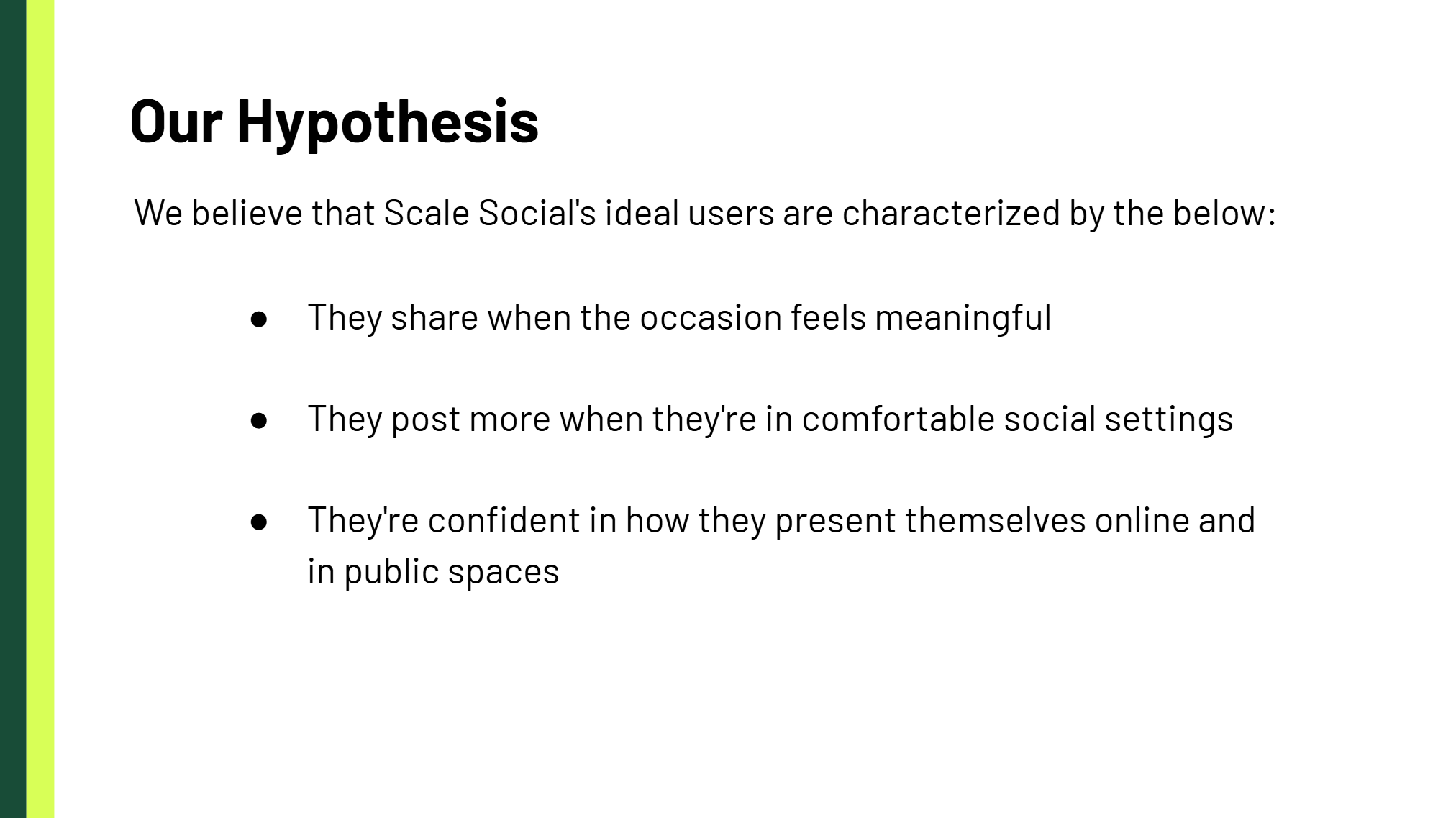
The client's hypothesis vs. the reality we uncovered
My Role: Building Bridges Between Data and Human Truth
While my teammates explored behavioral frameworks, I architected the technical backbone of our research:
Research Operations
200+ participant recruitment via Prolific
Data Architecture
Qualtrics survey design & deployment
Prototype Development
"Nourish" mid-fi prototype in Figma
Brand Identity
Visual design system & naming
Data Synthesis
Statistical analysis & pattern recognition across 3,600+ data points
Week 1-3: The Ground Truth That Changed Our Direction
My Chili's Experiment
Saturday, 6pm. Full parking lot. I wasn't just observing—I was testing.
The Setup
- Location: Chili's Restaurant, Durham
- Time: Peak dinner hours
- Duration: 90 minutes
- Groups: 10 observed
- My Role: Observer + Experimenter
What I Documented
- 8/10 groups: Families deeply engaged with each other
- 3/10: Couples focused on conversation
- 1/10: Single diner on device (not photographing food)
- Ziosk tablets at every table—largely ignored
My Behavioral Test
At minute 20, I deliberately photographed my meal, making it visible to surrounding tables.
Result: Zero mimicry. No social influence. No one followed suit.
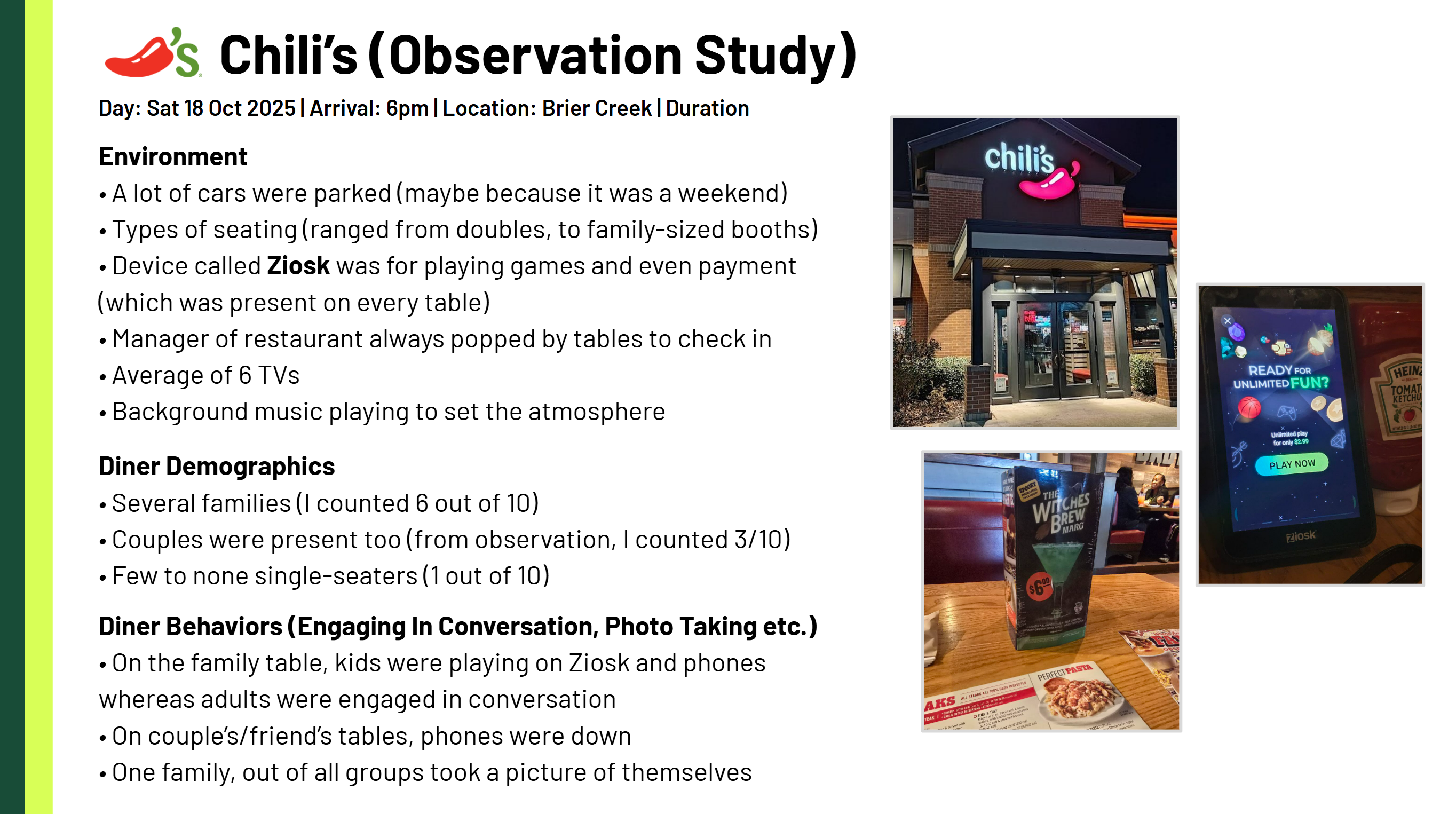
Real-world behavioral patterns that challenged our assumptions
Week 4-6: Building the Research Machine
How I Transformed Hunches into Data
I didn't just run a survey, I built a data pipeline that could validate or destroy our assumptions using Prolific for participant recruitment and Qualtrics for survey deployment and analysis.
My Prolific Recruitment Strategy
Screening Criteria:
- Age: 18-65
- Dining frequency: ≥2x/month
- Social media: Active user
- Location: United States
- Compensation: $3/10 minutes
My Quality Control:
- Built in 2 attention check questions
- Excluded responses under 3 minutes
- Achieved 85% completion rate (industry standard: 70%)
The Qualtrics Architecture I Designed
18-question survey with strategic flow:
Q1-4: Behavioral Frequency
Q5-8: Contextual Mapping
Q9-13: Decision Drivers
Q14-18: Sharing Preferences
The technical infrastructure that powered our insights through Prolific and Qualtrics
Week 7-9: The Nourish Prototype
My Behavioral Testing Instrument
I didn't design features. I designed a mindset detector.
Using Figma Make, I generated 50+ name options. "Nourish" won because it captured dual meaning:
- Physical nourishment (food)
- Emotional nourishment (connection)
The Four Variables I Tested
| Variable | Testing Approach |
|---|---|
| Posting Intention | Story Mode (high intent) vs Quick Mode (spontaneous) |
| Privacy Comfort | Hide location, timestamp, identity toggles |
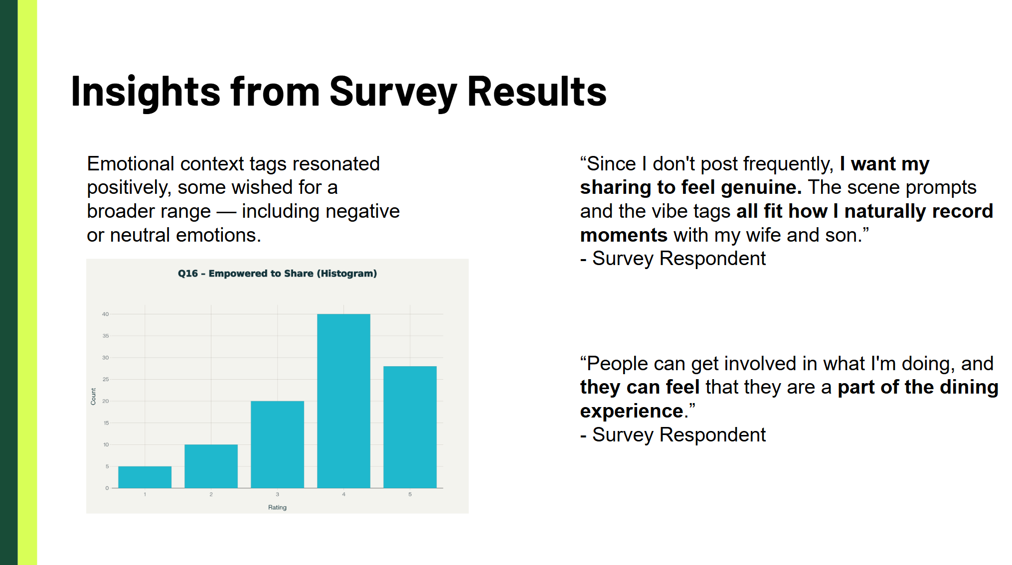
| Emotional Expression | Emotion tags: Cozy, Joyful, Grateful, etc. |
| Effort/Pace | 2-tap Quick Mode vs 5-step Story Mode |
15+
Screens
8
Interaction States
4
User Flows
6
Testing Sessions
Prototype Walkthrough
Video presentation showcasing the Nourish prototype and key features
Quick Mode - 2-tap spontaneous sharing
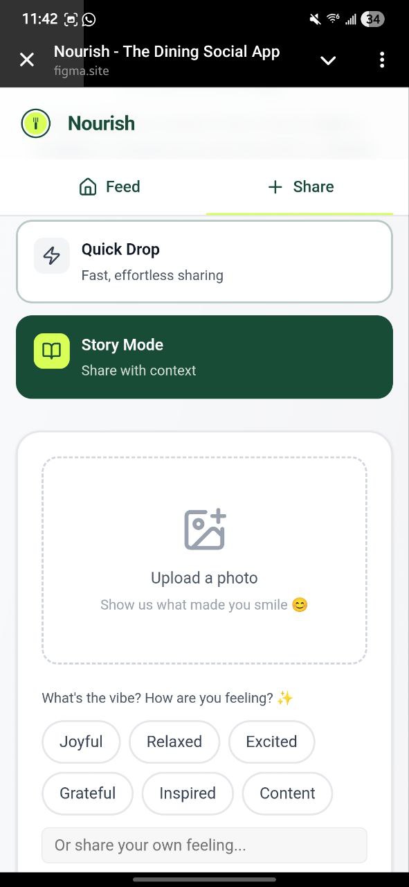
Story Mode - 5-step contextual sharing
Design Evolution: Simplifying the Experience
The Nourish app went through a critical iteration where we streamlined from three modes (Quick Mode, Story Mode, and Professional) to just Quick and Story. This simplification came from testing insights showing users were confused by too many choices.
Additionally, we conducted a comprehensive language review across the app to ensure the experience felt seamless and intuitive. Every button, label, and instruction was refined to reduce cognitive load and align with users' mental models.
Week 10-11: Testing & Revelation
The Moment Everything Clicked
Participant Testing Session
Benov (47, Senior Library Assistant, Duke Libraries) testing the Nourish prototype in a real library setting
"Now that I'm older, I'm a lot more reserved... I try to be more anonymous when posting to wider audiences."
— T.Benov (Senior Library Assistant, Duke Libraries)
This wasn't about age—it was about identity boundaries.
Our Testing Insights
| Age Group | Quick Mode | Story Mode |
|---|---|---|
| Under 30 | 75% | 25% |
| 30-45 | 50% | 50% |
| Over 45 | 20% | 80% |
Key Discovery: Older users don't want less technology—they want more context.
Testing revealed patterns that transcended simple demographics
The Framework I Helped Uncover: P-B-P
Three Mindsets, Not Demographics
Through my data analysis, patterns emerged that transcended age and income:
Purpose-Driven Users
Profile: Gen X, expertise-sharing
My Data: Post 1 in 5 dining experiences
"I'm more reserved about what I post"
Privacy-Conscious Users
Profile: Millennials, professional concerns
My Data: 35% only share with close friends
"I wouldn't post in real-time"
Boundary-Driven Users
Profile: Public-facing careers
My Data: 5% post work dinners
"Patients might see this"
My Impact: Data That Changed Strategy
The Numbers I Uncovered
200+
Survey Responses
85%
Completion Rate
3,600+
Data Points Analyzed
12
Key Insights Identified
The Behavioral Paradox I Proved
What Scale Social Assumed:
More dining → More posting
What My Data Revealed:
More dining → LESS posting
(routine kills shareability)
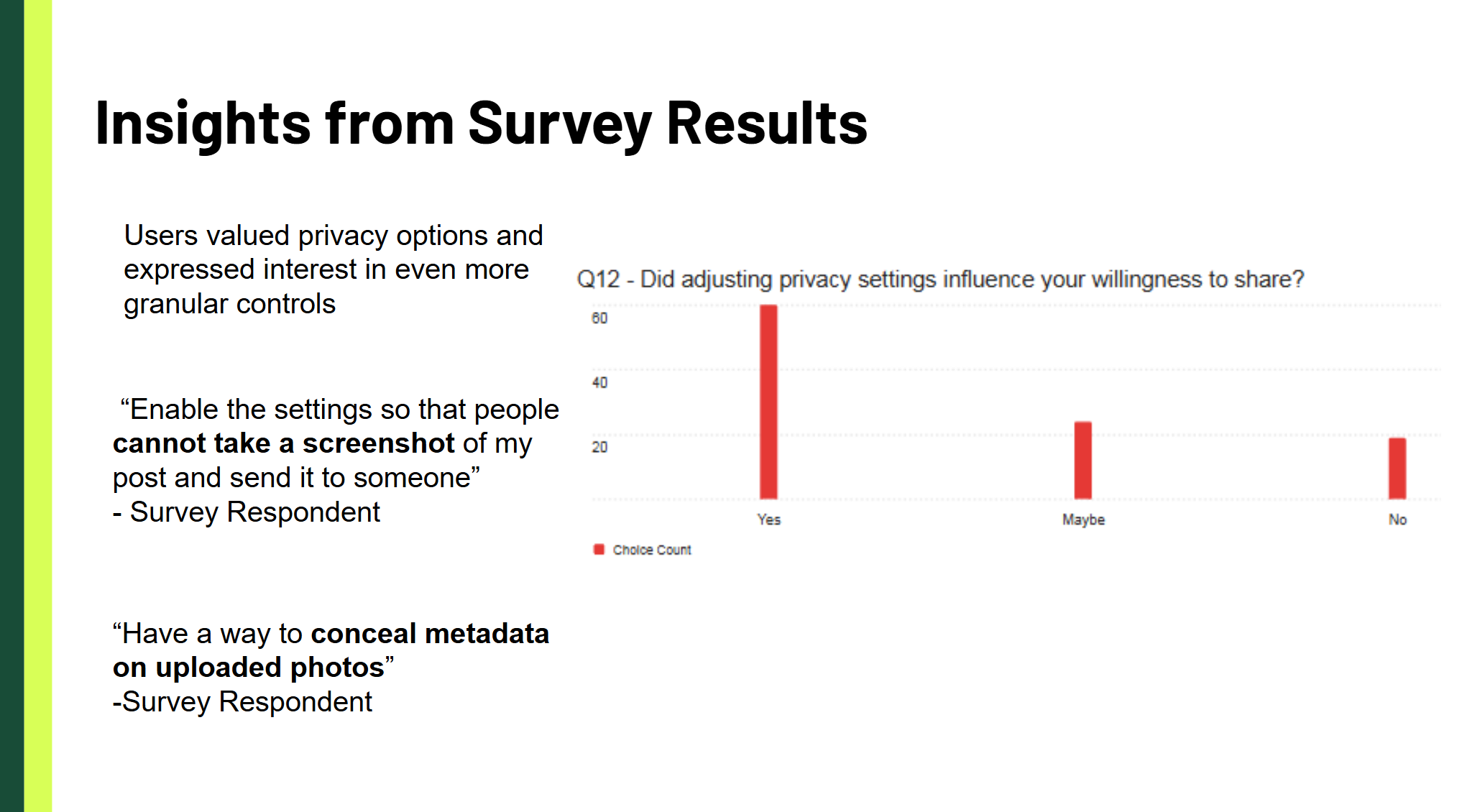
Privacy's Role in Sharing
With clear privacy controls:
- 68%more likely to share
- 41%want screenshot prevention
- 29%request metadata stripping
Reflection: What I Learned About Design Technology
Before This Project
"How can technology solve user problems?"
After This Project
"How can technology reveal what users actually need?"
My Technical Approach Crystallized
OBSERVE SYSTEMATICALLY
Ground truth > Assumptions
BUILD MEASUREMENT INFRASTRUCTURE
Robust data > Hunches
PROTOTYPE BEHAVIORS
Test mindsets > Features
SYNTHESIZE HOLISTICALLY
Connect patterns > List findings
Outcomes & Impact
For Scale Social
Strategic Pivot Based on My Research:
- Target occasion-driven sharers, not frequent diners
- Build for moments, not meals
- Privacy-first, not publicity-first
For My Practice
What This Project Proved About My Capabilities:
- I can architect research at scale (200+ participants)
- I can translate data into strategic narratives
- I can prototype behaviors, not just interfaces
- I can bridge technical execution with human insight
The Bigger Picture
This project taught me that being a Design Technologist isn't about building the most sophisticated tools—it's about building the right infrastructure to understand human complexity.
Every line of code, every survey question, every prototype interaction served one purpose: making invisible human behaviors visible and designable.
Scale Social didn't need better filters. They needed to understand why a 47-year-old becomes "more reserved" with age. Why a PhD student won't post in real-time. Why a financial consultant keeps dining private.
I built the bridge between those human truths and actionable design decisions.
"The best design technology doesn't just answer questions—it reveals the questions we should have been asking all along."
— Michael Dankwah Agyeman-Prempeh
Project Details
Timeline
12 weeks (Sept - Dec 2025)
My Role
Design Technologist
(Research Ops & Prototyping)
Team
Nicole Turpin, Thien Vo, Michael Agyeman-Prempeh
Advisors
Prof. Vivek Rao & Doug Powell
Context
DTK522 Design Innovation Studio III, Duke University